In the modern web development landscape, image optimization isn't just a nice-to-have feature—it's a critical component of user experience and website performance. Images account for an average of 50-60% of a webpage's total size, making format selection one of the most impactful optimization decisions you'll make. With emerging formats like WebP and AVIF joining traditional favorites like JPEG and PNG, choosing the right format has become both more powerful and more complex.
Why Image Format Matters: The Performance Impact
The difference between image formats isn't just theoretical—it has real-world consequences for your website's success. A study by Google found that websites loading in under 3 seconds had bounce rates 32% lower than those taking 5 seconds. Since images are typically the largest assets on a page, image format optimization directly affects:
- Page Load Speed: Smaller file sizes mean faster downloads, especially crucial for mobile users on slower connections
- SEO Rankings: Google's Core Web Vitals include loading performance as a ranking factor
- User Experience: Fast-loading images create a smoother, more professional browsing experience
- Bandwidth Costs: For high-traffic sites, optimized images can significantly reduce hosting and CDN expenses
- Conversion Rates: Amazon found that every 100ms of latency cost them 1% in sales
JPEG: The Reliable Workhorse
JPEG (Joint Photographic Experts Group) has been the internet's go-to image format for decades, and for good reason. It excels at compressing photographic images with gradual color transitions, making it ideal for portraits, landscapes, and product photography.
Best Use Cases:
- Photographs and images with many colors
- Images where slight quality loss is acceptable
- Situations requiring maximum compatibility across all browsers and devices
- Large hero images and background photos
Optimization Tips: Modern JPEG compression allows quality settings from 0-100. For web use, quality between 75-85 provides excellent visual results while maintaining small file sizes. Progressive JPEGs load incrementally, showing a low-resolution preview that gradually sharpens—ideal for larger images. Avoid JPEG for graphics with text, logos, or sharp edges, as the lossy compression creates visible artifacts.
PNG: Transparency and Sharp Graphics
PNG (Portable Network Graphics) is the format of choice when you need lossless compression or transparency support. Unlike JPEG, PNG preserves every pixel exactly as created, making it perfect for graphics that demand precision.
Best Use Cases:
- Logos, icons, and graphics with text
- Images requiring transparency (PNG-24 supports alpha channel)
- Screenshots and diagrams with sharp edges
- Images where quality cannot be compromised
Optimization Tips: PNG comes in two main variants: PNG-8 (256 colors, smaller files) and PNG-24 (millions of colors, larger files). For simple graphics, PNG-8 often suffices. Tools like pngquant can reduce PNG file sizes by 50-80% while maintaining visual quality through intelligent color reduction. Avoid PNG for photographs—the lossless compression results in files 2-5 times larger than equivalent quality JPEGs.
WebP: The Modern All-Rounder
WebP, developed by Google, represents a significant leap forward in image compression technology. It supports both lossy and lossless compression, transparency, and even animation—combining the best features of JPEG, PNG, and GIF in a single format.
Best Use Cases:
- Virtually all web images where browser support allows
- Photographs requiring smaller file sizes than JPEG
- Graphics needing transparency with better compression than PNG
- Animated images as a GIF replacement
Performance Benefits: WebP typically achieves 25-35% smaller file sizes compared to JPEG at equivalent visual quality, and 26% smaller than PNG for images with transparency. The savings compound across an entire website. A page with 20 images could see total image weight reduced by hundreds of kilobytes—translating to noticeably faster load times, especially on mobile devices.
Implementation Strategy: While WebP enjoys broad support (over 96% of users globally as of 2025), implement it with fallbacks for older browsers. Use the HTML <picture> element to serve WebP to compatible browsers while falling back to JPEG or PNG for others. Modern image CDNs can automate this process, detecting browser capabilities and serving optimal formats automatically.
AVIF: The Next Generation
AVIF (AV1 Image File Format) is the newest addition to the web image format family, promising even better compression than WebP. Based on the AV1 video codec, AVIF delivers exceptional quality-to-filesize ratios, particularly for high-resolution images.
Best Use Cases:
- High-resolution hero images and photography
- Situations where maximum compression is paramount
- Progressive web apps targeting modern browsers
- HDR content and wide color gamut images
Performance Benefits: AVIF can achieve 20-30% smaller file sizes than WebP, and up to 50% smaller than JPEG at comparable quality. For a high-resolution hero image, this could mean the difference between a 500KB JPEG and a 250KB AVIF—cutting load time in half. The format also excels at preserving detail in challenging scenarios like gradients and textures.
Current Considerations: As of 2025, AVIF has approximately 85% browser support, with notable gaps in older browser versions. Implement AVIF as the first choice in a <picture> element, falling back to WebP and then JPEG. Encoding AVIF images is more computationally intensive than other formats, so consider pre-generating AVIF versions during your build process rather than converting on-the-fly.
SVG: The Scalable Champion
SVG (Scalable Vector Graphics) isn't a raster format like the others—it's vector-based, meaning it describes images using mathematical formulas rather than pixels. This fundamental difference makes SVG uniquely valuable for certain use cases.
Best Use Cases:
- Logos and brand identity elements
- Icons and simple illustrations
- Charts, graphs, and data visualizations
- Any graphic that needs to display perfectly at any size
Unique Advantages: SVG files scale infinitely without quality loss—perfect for responsive design where assets must look sharp on both mobile devices and 4K displays. They're also typically very small (a complex icon might be just 2-5KB) and can be styled with CSS, animated with JavaScript, and even edited in code. For websites with extensive icon systems, SVG can dramatically reduce page weight compared to using PNG sprites.
Optimization Tips: Export SVG files from design software with optimization in mind—remove unnecessary metadata, decimal precision, and hidden layers. Tools like SVGO can automatically clean SVG code, often reducing file sizes by 50-80%. For complex illustrations or photographs, SVG isn't appropriate—the file size will balloon compared to raster formats.
Format Selection Decision Tree
Choosing the optimal format becomes straightforward with this decision framework:
- Is it a logo, icon, or simple illustration? → Use SVG
- Does it require transparency? → Use WebP (with PNG fallback) or AVIF (with WebP/PNG fallbacks)
- Is it a photograph or complex image? → Use AVIF (with WebP/JPEG fallbacks) for best compression, or WebP (with JPEG fallback) for broader support
- Does it have sharp text or edges? → Use PNG-8/24 or WebP lossless
- Is maximum compatibility critical? → Use JPEG for photos, PNG for graphics
Advanced Optimization Techniques
Responsive Images: Don't serve the same image size to all devices. Use srcset and sizes attributes to provide appropriately sized images for different screen dimensions. A mobile user doesn't need a 2000px wide image—serving a 800px version can reduce file size by 70% or more.
Lazy Loading: Implement native lazy loading (loading="lazy") for images below the fold. This prioritizes above-the-fold content and reduces initial page weight. Combined with format optimization, lazy loading can improve Largest Contentful Paint (LCP) scores significantly.
Quality vs. Size Balance: Visual perception studies show that most users can't distinguish between an image at 100% quality and one at 80-85% quality. Aggressive compression to 60-70% starts showing visible artifacts but may be acceptable for background images or thumbnails.
Color Space Optimization: Use sRGB color space for web images unless you specifically need wider gamuts. Reducing from Adobe RGB to sRGB can save 10-15% file size with no visible difference on standard displays.
Automation and Tooling
Manual image optimization isn't scalable for modern websites. Implement automated solutions:
Build-Time Optimization: Integrate image optimization into your build process with tools like sharp (Node.js), Pillow (Python), or ImageMagick. These can automatically convert formats, resize images, and optimize compression during deployment.
CDN Image Optimization: Services like Cloudflare Images, Cloudinary, or Imgix automatically serve optimal formats based on browser support, resize images on-the-fly, and apply smart compression. While these services have costs, they eliminate manual optimization work and ensure consistent quality.
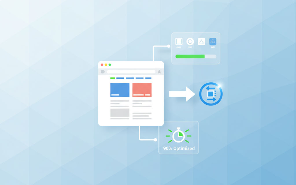
Online Image Processing Tools: For one-off optimization or batch processing without coding, browser-based tools offer professional results instantly. These tools typically support format conversion, compression optimization, and batch processing—perfect for content creators and marketers who need quality results without technical expertise.
Measuring Success: Performance Metrics
Optimization isn't complete without measurement. Track these key metrics:
- Total Page Weight: Aim for under 1MB for initial page load, with images comprising no more than 500-700KB
- Largest Contentful Paint (LCP): Should occur within 2.5 seconds—optimized image formats directly impact this Core Web Vital
- Time to Interactive (TTI): Heavy images delay interactivity; optimization reduces this metric
- Bandwidth Savings: Calculate percentage reduction in image data transferred
Use tools like Google PageSpeed Insights, WebPageTest, or Lighthouse to audit your site's image performance. These tools identify opportunities for format optimization, sizing improvements, and implementation issues.
Future-Proofing Your Image Strategy
The image format landscape continues evolving. JPEG XL (JXL) is on the horizon, promising even better compression and features. Implement your image strategy with flexibility in mind—use content management systems and build tools that can easily adapt to new formats as browser support grows.
The principle remains constant regardless of format evolution: serve the smallest possible file that meets your quality requirements, delivered in a format that maximizes compression while ensuring browser compatibility. Master this balance, and you'll create websites that load fast, look great, and provide excellent user experiences across all devices.
In 2025, image format optimization represents one of the highest-impact, lowest-effort improvements you can make to web performance. With modern formats like WebP and AVIF offering substantial file size reductions, and browser-based tools making optimization accessible to everyone, there's never been a better time to optimize your images and reap the benefits of faster, more efficient websites.